Paper In A Digital World
I like technical conferences. I haven’t been to one in years. This year my sons got me an invite to the Silicon Slopes Tech Summit. I’m not sure if Utah’s Wasatch Front is actually able to rival California’s Silicon Valley. But, there were dozens of companies in Salt Lake City’s Salt Palace Convention Center last week that were certainly going to give it a try.
There were companies you’d expect Microsoft, Adobe, Dell, Nasdaq, Vivant, Comcast, Salesforce. There were colleges and banks, Western Governers University, BYU, University of Utah, Zions Bank, Utah Valley University. There were even real estate broker, entertainment companies, Utah Jazz, BYU Athletics, golf courses, Real Salt Lake soccer (including their national championship trophy.)
The presenters were mostly tech people, CEOs, marketing directors, entrepreneurs, visionaries, and an occasional baseball player. The technology also spanned a gamut from specialized real estate listing programs to Microsoft for Startups.
One of the most striking things about the conference was the amount of paper. Everyone who attended got the requisite Conference Bag and inside the bag was a business book. One of three that I was given at the conference. Not .pdf files, not a Kindle version. Real, dead tree version books.
Nothing better illustrated the conference affinity for paper better than the conference schedule booklet. Here’s a picture.
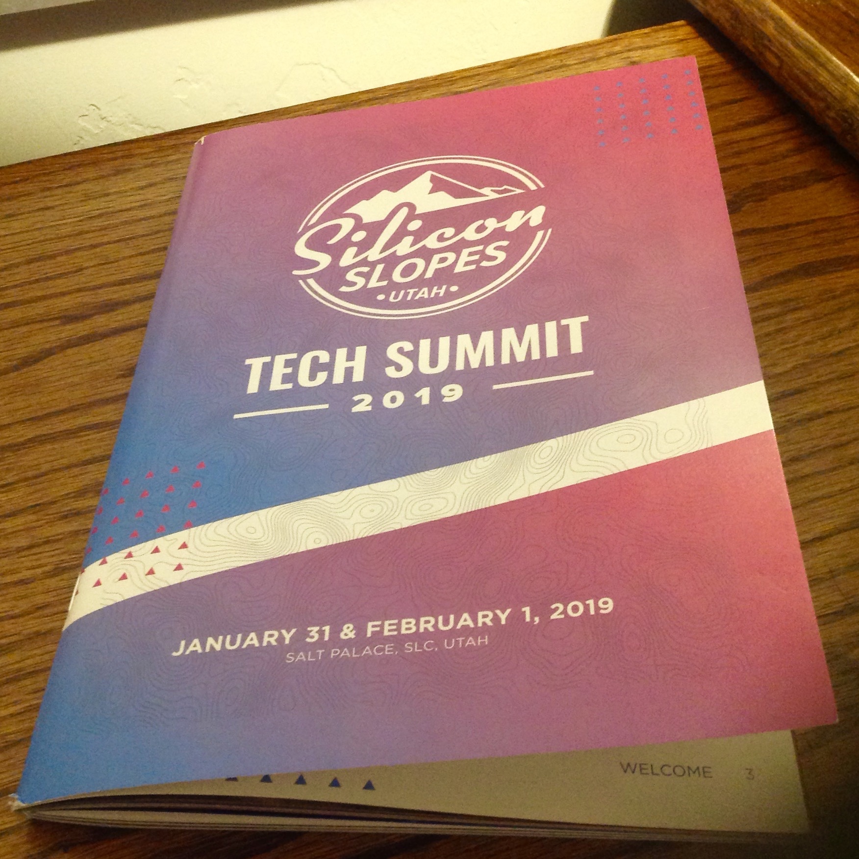
These booklets are common at conferences. They typically have a map, speaker bios and the full conference schedule. There’s also typically some sponsorship messages, and some places to take notes. At 107 pages of heavy grade paper, this version of the book seemed a little large for a two day conference.
And then I opened it. It was . . .colorfull. There were plenty of full page, full color ads. And there were also. . .more colorful full page ads.
  And then I found. . .
 yeah, there were a lot of ads.
Eventually I found the table of contents. It led me to the schedule of events. Strangely the schedule for the general sessions, the keynote sessions, were on page 36 and the schedule for the breakout sessions was on page 74. In between was were several dozen pages of full color full page ads. . .with no page numbers.
I tried dogearing the pages to make it easier to find my way around the book. My first day at the conference was mostly spent on the exhibitor floor. I attended multiple demos. I talked to people. I played a few games. I bumped into old friends and newer ones. I got to hang out with my sons.
Day two I wanted to spend attending sessions. There were several general and breakout sessions that I wanted to attend. I flipped back and forth between the separate schedule pages. Finally, I decided to simply rip out the pages that were not part of the schedule. It quickly became obvious that it was simply easier to rip out the pages that I would need for second day’s events.
Here’s what I was left with.
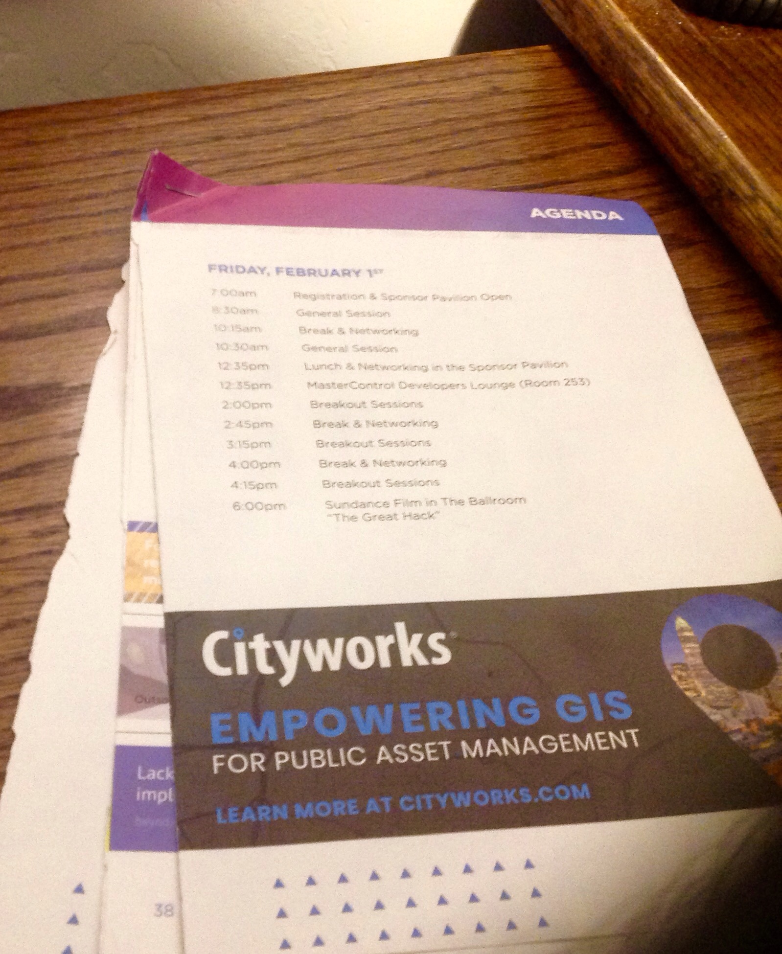
I never did find the map.
Rodney M Bliss is an author, columnist and IT Consultant. His blog updates every weekday. He lives in Pleasant Grove, UT with his lovely wife, thirteen children and grandchildren.
Follow him on
Twitter (@rodneymbliss)
Facebook (www.facebook.com/rbliss)
LinkedIn (www.LinkedIn.com/in/rbliss)
or email him at rbliss at msn dot com(c) 2018 Rodney M Bliss, all rights reserved

that is the most extremely vendor marketing driven booklet I’ve seen, though I’ve seen close. Its almost like the “all classic commercials all the time” radio station in Demolition Man, we sure track that way.
At least one of the local ones I go to(SecTor.ca) is on the other end where where there isn’t much more advertising than Silicon Slopes Tech Summit’s had of real content. It is largely session and presenter notes, with the maps in the middle where it naturally opens to.